Posted On: Wednesday - May 26th 2021 7:10PM MST
In Topics: Kung Flu Stupidity
This post is NOT a stand-up comedy routine, but the Kung Flu PanicFest itself is a lot closer to one.
Let's talk "excess deaths" today. This is something I did preliminary number-crunching on a couple of months ago already, but never got around to doing rigorously (see postscript). A late Steve Sailer PanicFest post - Weekly Total Deaths Finally Returning to Normal - got me going again. His big EXCESS DEATHS! graph shown there is from this CDC page.
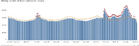
(The reader can go to either of the links above to see this better. I'm just trying to show the shape here, shrinking it way down to fit this page though.)
What are excess deaths? Simply, it's the number of fatalities in America in a time period minus the "normal" number of fatalities. Sound simple to you? No, well first of all, what is normal? One can average out a few years to get that, which ought to take out some of the variability from bad flu years, lulls after bad flu years, wartime (not a factor yet, luckily), etc. You get some sort of average, but ...
Here's my problem right away with this CDC graph. That orange "normal" curve is too damn level! If one understands that the American population is aging fairly quickly historically, as I do, one can see that this base curve CANNOT be right. Please look at it greatly enlarged on that CDC page. It hasn't gone up at all from January of '17 to May of '21. There's something wrong.
Last Fall, when Steve Sailer and others started bringing up this excess death business, their point was that, no matter what kind of shenanigans are going on, more people dying mean it must be the Kung Flu having a big effect. That's not a sure thing either, but then I'll get to that in another post. In this post, I'm looking at something very simple. It does not involve "cases", deaths FROM vs WITH Covid-one-niner, or anything medical. It's just pure numbers, from the US Census Bureau and the CDC itself, the latter regarding "regular" deaths (if that's a thing).
Months ago, I went search for exactly what the heck was going on with this base curve. From the methodology notes at the bottom of the same CDC page linked-to above (and by Mr. Sailer), one can read the following:
Weekly numbers of deaths by age group and race/ethnicity were assessed to examine the difference between the weekly number of deaths occurring in 2020 and the average number occurring in the same week during 2015–2019 and the percentage change in 2020. [My bolding]Whoa, whoa, wait a cotton-pickin' minute here. That average may not cut it. So, I went and found some nice US Census tables, even conveniently in .xlsx (spreadsheet) format. Here's a sample from the '19 one**, but I found them for '15 - '19:
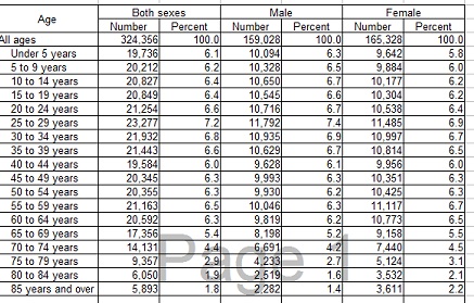
Very good stuff. These (with the other 4 years) are nothing but information on the ages of Americans. One can see from a few of these that the higher-age brackets are getting bigger. It's no huge change, but it's enough to matter.
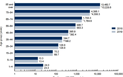
The next thing I needed was "normal" mortality numbers for these different age brackets. It took me an hour or so of searching to find Statista (which is nothing more than a site that sucks in statistics from elsewhere and displays them, I believe) page with this info. The only bad thing was the brackets there are 10-year ones. While I was writing comments under that latest iSteve post, I found out that this info. came straight from the CDC (yes, CDC again!) .pdf files like this one for '19. In fact, the CDC one for '17, with bar graphs for '17 and '16, was missing the under 5 y/o and 5-14 y/o age bracket, exactly as Statista was. (I just used a 4 yr. average instead of 5, but see next paragraph.) Here's a sample from the '19 CDC .pdf report:
Alright, so I went to the
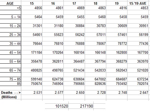
(That last row "85" should say "85+". Calc thought I was doing an operation. It is smarter than me, so ...)
See those 2 numbers at the bottom? (Image-wise, I had to cut them off from the right side of the spreadsheet and paste them underneath). Those are the gist of this post. Taking the '19 normal death numbers minus that CDC '15-'19 average gives a difference of > 101 thousand more deaths. That's not even thinking of 2020, when the Kung Flu "hit us like a ton of ... something..."*** Subtracting the '15 normal deaths from '19 gives 217 thousand more. It's just that Americans are getting older. It doesn't look that was being taken into account for properly.
While writing comments on iSteve, I found a NY Times article that alleged the CDC did some linear regression for this base curve. I worked out a number for 2020 for that. However, I'm not sure how the NY Times alleges the CDC did that. It may have been much more complicated. However, that doesn't change the fact that the damn "Excess Death" graph has that orange curve that doesn't reflect a population increasing in age, period!
They'll be more philosophical ranting about this in an another post to come soon.
PS: I finally got my spreadsheet foo going from, well, it's been quite a while. I'm doing nothing at all fancy, but I just needed to get to a certain, USABLE computer, as in usable for computing, and get going. It was pretty fun really, and man, did it save a lot of time versus calculating and writing on paper. I was even able to import in numbers from those census bureau site .xls files. (I'm using OpenOffice Calc - we've come a long way from Lotus 123... actually NOT, in usability, though I'm sure in computing power and memory limits.)
I'm happy with my lack of errors, though, from my calculations of this past Sunday. After lots of crunching, the death numbers, if off at all, were off by just single digits out of hundreds of thousands.
So Peak Stupidity did not meet its 1st promise made in Unz Review comments, but we've met are fall-back goal. It's still Wednesday, right?
** Careful clicking on this though - it will open up your Excel program. You can get it to open another program, such as OO Calc.
*** I would use 2020 American population numbers by age, but I couldn't find the exact same format. I did recently find it for EVERY year of age. Hell, I got spreadsheets, so I'll work on that shortly.
Comments:
Adam Smith
Sunday - May 30th 2021 12:43PM MST
PS: Good afternoon...
You didn't miss anything Mr. Moderator. Sailer has left that comment in moderation purgatory for the last 3 days. Maybe he'll approve it. I don't know. He hasn't deleted it yet. Maybe he didn't like the way I used the word poo or something. He did approve my comment to Mr. Alarmist. I thought he wouldn't because I used the word chimpout.
☮
Moderator
Saturday - May 29th 2021 8:52PM MST
PS: Thanks for the comments, all. Alarmist, thanks for that point about the UK. Regarding the range for these estimates of "normal" when different stuff happens every year. I agree, especially regarding the stock market "technical" advisors. You can show one thing, or you can show the opposite, depending on when you start and end. That's why the explain EVERYTHING that cause the price change AFTER the fact.
Robert, I'd give back the big bucks here, cause I feel like I should have noted the thing I did in my post today a lot earlier. That's why they hesitate to pay me the big bucks, haha.
Adam, I somehow missed your reply on unz. You FIFM. That's much more succinct.
Robert, I'd give back the big bucks here, cause I feel like I should have noted the thing I did in my post today a lot earlier. That's why they hesitate to pay me the big bucks, haha.
Adam, I somehow missed your reply on unz. You FIFM. That's much more succinct.
Adam Smith
Saturday - May 29th 2021 2:26PM MST
PS: Good evening everyone...
https://i.ibb.co/1sL07G1/replytoachmed.jpg
☮
https://i.ibb.co/1sL07G1/replytoachmed.jpg
☮
The Alarmist
Friday - May 28th 2021 8:36AM MST
PS
I’m fortunate to have a job where I could indeed literally make up a statistic and have it go unchallenged. It helps to have a few years where performance spoke for itself. At some point, those with a long streak of luck look like Delphic Oracles. I might have to retire sometime soon, before the tide goes out and they see I’m sans maillot de bain.
My favorite trick to overcome consultants, advisors, and money managers touting their great performance against some BS benchmark is to suggest their “outperformance” (alpha) doesn’t appear to be statistically significant, especially when considered net of fees. The next fave move is to point out their gratuitous choices of holding periods, e.g. some manage to leave out the GFC of 2008 or the Dot Com implosion, and that gets easier as new kids come around and only have track records based on the Fed Put.
Adam Smith
Friday - May 28th 2021 8:08AM MST
PS: Good morning everyone...
Mr. Moderator, thanks for your time consuming work. It's unfortunate that people have to do research projects to fact check what should be simple stats. Glad to hear you're having fun with it.
Robert, Mr. Anon • Lol! Thank you both.
http://1.bp.blogspot.com/_oqH68z1KYWk/SCMhkz0851I/AAAAAAAAAGQ/7hQDeVNcikA/s400/5652.strip.print.gif
https://cdn.someecards.com/someecards/usercards/1339775522675_6657949.png
☮
Mr. Anon
Friday - May 28th 2021 12:14AM MST
PS
@Robert
"Thank you for that, Mr. Moderator. Seven out of Ten lies are told with statistics."
Did you know that 87% of statistics are just made up?
@Robert
"Thank you for that, Mr. Moderator. Seven out of Ten lies are told with statistics."
Did you know that 87% of statistics are just made up?
Robert
Thursday - May 27th 2021 8:04PM MST
PS: Also, Mr. Moderator, thanks for explaining the process you used to get those 2019 numbers. Without that, they are essentially meaningless.
Looking forward to the 2020 numbers. After all, what are we paying you the big bucks for?
Looking forward to the 2020 numbers. After all, what are we paying you the big bucks for?
Robert
Thursday - May 27th 2021 3:16PM MST
PS: Thank you for that, Mr. Moderator. Seven out of Ten lies are told with statistics.
P.S. I probably said this here before, but my favorite statistic is, "People with bigger feet spell better."
P.S. I probably said this here before, but my favorite statistic is, "People with bigger feet spell better."
Moderator
Thursday - May 27th 2021 8:50AM MST
PS: Dieter, I would say that the initial web searching, and set of calculations I did a couple of months ago just to see if this is significant took 2 or 3 hours. Then, I spent 4 hours on it on Sunday, when writing on the iSteve thread. Doing this on the spreadsheet took only 2 hours or so. You are right in the ballpark. (I'm not counting writing the post itself.)
The Alarmist
Thursday - May 27th 2021 3:26AM MST
PS
That is to say, the peaks in the absolute count of deaths against an estimate of “normal” deaths is merely interesting, but one of the controls on a longitudinal dataset is to normalise the set by dividing by the population for each of the underlying datapoints.
Controlling against the average is subject to being gamed by adjusting the holding period. The Institute of Actuaries in the UK has demonstrated this in spades recently, as 2021 started to look like it was going to be a lower mortality year than the average, so they started benchmarking against 2019 alone). As I noted before, if you go back to the nineties, 2020 was not among the worst years in terms of death per millions. When you then adjust for age, WuFlu is a nothingburger in terms of Qualys lost.
(see https://lockdownsceptics.org/2021/05/26/why-has-this-mortality-monitor-suddenly-changed-its-baseline-from-the-ten-year-average-to-2019-the-lowest-mortality-year-ever/)
I
The Alarmist
Thursday - May 27th 2021 3:09AM MST
PS
I don’t know about the US, but if you go back to the aughts or to the nineties in UK stats, you’ll see a number of flu years where deaths per million are worse than those attributed to the WuFlu.
I don’t know about the US, but if you go back to the aughts or to the nineties in UK stats, you’ll see a number of flu years where deaths per million are worse than those attributed to the WuFlu.
Dieter Kief
Thursday - May 27th 2021 1:39AM MST
PS
PS Hi Mod - congrats! How many hours did this fine work take you? - Let me guess - 10+? - And all for this immaterial goal: To enlighten us all around here - and elsewhere - "in this universe" (Mike Royko (and Bob Dylan...on "Street Legal"). - Thanks a lot Mod!
(I wrote a bit more but will wait for YOUR philosophical rant to post it).
Back when I was under moderation (~ 3 years out of the last 4), he would knock out a few that I could see were a little too crude.
I can get more utility or enjoyment of the site since I can now put comments up right away. I can have an actual conversation. It would suck going back - I don't know what it took to get this elite status I have, haha*. Policies are kept under wraps, including by Mr. Unz, as I've read people ask him the deal and I never saw a reply.
Oh, I do donate money. I'm not saying that SHOULD do it, but probably that was it.
* Obviously, it was Mr. Sailer that set something, as on some of the other writers' threads, the comments wait a while. It is never nearly as long as Mr. Sailer's ones back then - I was positive he had to look at them, as his LA waking hours corresponded pretty well.